The Seductiveness of Imagery
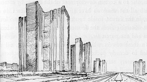
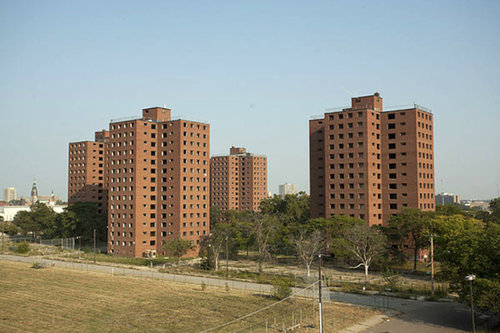
Did you know that less than 20% of human communication is verbal? That means 80% of all human communication is not coming out of our mouths. By nature, humans are visual creatures. Before we developed advanced vocal languages, we inferred our emotions, intentions and ideas with visual expressions using the parts of our body and with drawings - symbolic images that represented a certain meaning. Today linguistics are highly advanced systems - there are over 7,000 languages in the world today - but visual information is still the primary influencer of human behavior and learning according to leading behavior experts and scientists. In architecture, visual information is supreme. Architects often create very evocative images of their designs as a means to influence clients, customers, and users. The seductiveness of the drawing is very powerful but can also be used for the wrong motives. It has the ability to hide poor design and influence transactions that are not worth their value.
When buying or renting a home, property or apartment, it's imperative that you look beyond the seductive factor and "modern" code words. Ask the right questions (the tough questions) that often have nothing to do with appearances. Don't get "caught up in the hype".
The "REAL" Estate trap
In the commercial real estate market developers, property managers and realtors will often show potential buyers a floor plan and a bunch of glossy images of the space they are marketing provided by the architect (or a rendering artist). These images are usually photo-shopped,"perfectly" polished, & pristine. They are often unrealistic and glamorized versions of what the property actually will be - a seductive strategy to get consumers to purchase or sign that lease. The same holds true for a property once its completed. It's stagged in a perfect visual manner to get you to make a purchase. It's all psychological. The strategy is not bad, but too often it's used to hide poor design, construction, space planning, or lack of space in general. A common maxim I like to use is that one must "look beyond the wallpaper". In other words, look beyond the fancy, seductive images and the shiny finishes and advanced appliances Instead, look at the quality of the spatial design and assembly. It's up to the consumer to investigate the space beyond what's immediately visible. Find a good realtor that will do more than try to sell you the shiniest thing on the market.
Good Drawing, Bad Design.
When I was in architecture school as an undergraduate I was a terrible designer. This was partly because I was concerned more with learning software than how to design. I'd use the latest software to do my projects and make them look photo-realistic (or so I thought). I was unconsciously using these programs to make the drawings look 'sexy' and cover up the bad design. When it came time to present, my studio professors were able to look right past the fancy programs and see just how poorly the design was. Then and there I learned a valuable lesson.
Now as a working professional I still go back to university to teach and critique student work. I see the seductive factor playing out in the studios today, especially at the undergraduate level. It's even more exaggerated now because of the increased variety and allure of digital programs available to students. They struggle the same way that I did, grappling with trying to do good design and make a sexy looking drawing. This happens in professional practice as well. Firms pump out fancy drawings of their sleek, curvy, and shimmering glass buildings manipulated to portray false, but seductive conditions. This is done to create a certain visual storyline for the viewer and often times used to mask an incomplete design or perceived undesirable features. Nonetheless, it is important for architectural students, architects, and patrons of architecture to recognize that good, competent and functional design is paramount, the 'sexy' factor is a secondary complement to good design.
Be Good, Then Seductive
The important lesson here is to simply be aware of the "Seductiveness of the Drawing". The allure of buildings and spaces that only look good on paper is very misleading. Sexy drawings are intrinsically not bad. And even I will agree that some times the designer should guide the conversation about a project by highlighting certain parts of a building. But these buildings must not only sell, they must also work - if we truly care about making quality environments. Details must be carefully thought out for proper assembly; context must be addressed properly; materials must be durable and used in the correct way, and much more. If architects (and students) put the same amount of concern they put in making seductive drawings, into designing simpler, well thought out, high quality stuff , the world would have many more great buildings.
It's important not just to LOOK GOOD, but also "BEY" GOOD. Take it from Beyonce.
To clients, consumers, and users of architectural products, look beyond the wallpaper. Question buildings and spaces beyond what you see on the surface. There might be some important aspects being hidden from you. Look beyond the facts and features, (square footage, energy efficient appliances, expensive finishes, etc.) and try to find the more personal benefits (comfort, quality of lifestyle, experience, functionality, etc)
To my fellow designers, we have a duty to provide good design, not just provocative images with no substance behind them. There is already a false stereotype that all architects (and designers) do is draw 'pretty pictures. Why feed into this? Why not show the world that we do a lot more by focusing our attention where it should be - on good all-around design for people. First function; then the flash and flare. As the old saying goes, "Everything that glitters, ain't gold".
![Fabric[K] Design](http://images.squarespace-cdn.com/content/v1/5846fe37ff7c5046fc8b98e8/1585703506724-ACFUCZ5FH3AGY64QWIFZ/FabricK-Design_Logo_1500x600_All+Green.png?format=original)


